How to use Excel for on-the-spot analytics


Connecting state and local government leaders
New add-ons for the spreadsheet program can combine Census, weather and demographic data to aid evacuations in an emergency.
At Microsoft’s recent U.S. Public Sector Federal Executive Forum, Ted Malone, federal platform specialist for Microsoft, demonstrated how the Excel spreadsheet application along with add-ons such as PowerPivot and GeoFlow could be used to gather data from disparate sources and combine it with geo location and mapping capabilities to deliver timely information to emergency response teams.
Malone drew a scenario of how weather forecast information about potential rainfall in low-lying coastal areas during Hurricane Sandy — which affected the entire U.S. eastern seaboard in October 2012 — could be combined with demographic census data and used to evacuate elderly people (70 years and older) from those lying-lowing areas in the path of the storm.
The demonstration involved pulling U.S. Geological Survey flood information, Census Bureau text-based demographic information and weather forecasting data generated by the National Oceanic Atmospheric Administration. After pulling this information from disparate databases and visually displaying it, Malone overlaid mapping and geographical data to visually show a map of population density and identify people over 70 in at-risk areas.
“What we are trying to show is that big data analytics [requires] many steps,” pulling different types of data from multiple sources, Malone said. Microsoft’s view is that users need a familiar, ubiquitous tool that provides compelling visualization, he said.
The following slides provide an example of how Excel and its add-on components can aid users deriving meaningful insight from their data.
Data mashups
Visual view
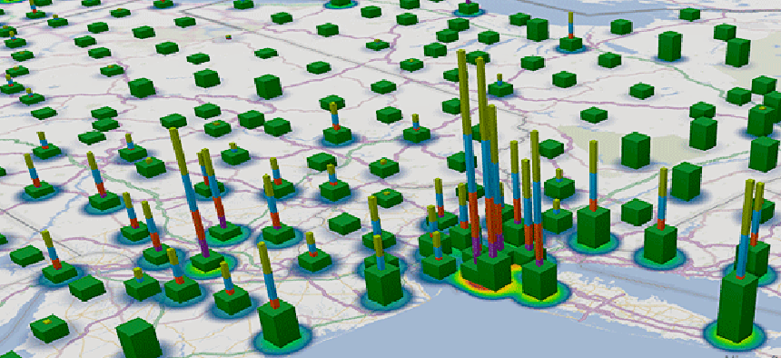
This population density visualization of Census data uses Bing maps and GeoFlow, a free add-in for Excel 2013 that lets users plot geographic and temporal data visually, analyze that data in 3D and create interactive tours to share the data with others.
At risk areas
Age demographic data is overlaid on the population density data, focusing on the elderly population. Next, rainfall prediction data and flood plain information (the blue circles) are added to the map to show the elderly population living in low-lying areas with high rainfall. This visualization represents the “at risk” areas where emergency management officials will likely need to deploy assistance for evacuations.
NEXT STORY: IEEE wants mobile devices to be more repairable


