DataViva tools give power to the people over open data


Connecting state and local government leaders
An team of MIT Media Lab professors and Brazilian economic policymakers partner on data visualization tools designed to help ordinary citizens mine government’s open data.
The Obama administration swept into office in 2009 with a vision of offering the public access to thousands of government datasets that could help foster application development, new approaches to policy or point the way to new markets and business opportunities.
The government’s open data repository, data.gov, last summer was updated to help make the site easier to navigate and the datasets simpler to use.
Now a team of private sector open data evangelists has introduced a set of Web-based applications designed to put data visualization tools directly into the hands of citizens, researchers or entrepreneurs who otherwise might lack the technical skills necessary to read the machine-based tables and spreadsheets common to government datasets.
The project began in 2011 when the Office of Strategic Priorities in Minas Gerais, the third largest of Brazil’s 26 states, was looking for a search tool to navigate some of its economic data. The Brazilians contacted the MIT Media Lab, which was then working on a project to help visualize data on trade between countries.
The upshot was the launch of DataViva, a website with the ambitious goal of providing data visualizations of the entire Brazilian economy over the last 10 years, a project that its creators say will require developing more than 100 million visualizations.
"Opening up data in a visual form is essential for transparency and to empower other people to use this data," César Hidalgo, director of the Macro Connections group at the Media Lab, told fastcodesign.com. "Most of the people interested in economic development data, like the data we are making available on DataViva, are people that do not have the technical skills needed to work with machine readable formats."
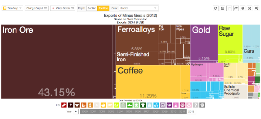
The site offers eight core visualization tools, including apps designed to show data in tree maps, geographical charts contrasting graphs. Some are meant to be “descriptive,” rendering the data in a simple or comparative way. Others are designed to be more analytical, using calculations that “facilitate the process of decision making,” according to the site.
One of the apps – Occugrid – is designed to analyze the recommended workforce for a given industry and “can be used to determine which occupations a location may need to hire in order to become more successful,” according to the report. Others might use the tool to compare the wages of different industries in a particular region or find which areas have a high concentration of skilled workers.
Another app, called Scatter, is designed to compare economic activities in a location based on different variables. The app might be used, according to the Dataviva site, to contrast how the construction or financial services industries might perform in a specific region based on the location and the complexity of its given supply chain.
Improved data visualization options will continue to be a priority for the federal government’s open data plans, said Data.gov evangelist Jeanne Holm. “When we visualize data, rather than just looking at a spreadsheet, it results in a visual and ‘gut’ understanding,” she said in a recent interview, “so the power of visualization is important.”


