The real killer app: Citizen service

To perform with the ease of Google and the personalization of Amazon, government apps need a thorough tune-up, from the user interface to the back end.
For all the disruption that the launch of HealthCare.gov caused, it had a number of healthy side effects, including a commitment to improving digital services at all levels of government, especially applications designed for mobile users.
Since then, the Obama administration set up the U.S. Digital Service to help federal agencies transition to digital systems, established the 18F tech incubator at the General Services Administration and requested $100 million in funding to back the efforts.
“Digital service is getting serious in part because of some high-profile services that didn’t work so well when we first rolled them out,” said Mike Kruger, director of the Commerce Department’s Office of Digital Engagement. “And that digital service has to be good. It’s no longer acceptable to be clunky and hard.”
Those requirements are increasingly being applied to citizen-facing mobile apps, which are rapidly becoming the tool of choice for accessing government data. Last year, research and analytics firm comScore estimated that a majority — 53 percent — of all digital media time is now spent on mobile apps.
“People want Google ease and Amazon personalization,” Kruger said. “If you work in the public or private sector, you have to deliver that kind of digital service. It’s got to be that simple.”
To perform at that level, government and industry executives say mobile apps need a thorough tune-up, from the user interface to the back end.
‘Become your user’
The first principle of building a government mobile app that meets industry standards is personalization, which involves the ability to zero in exhaustively on end-user preferences.
“You want to know what your users would do — how they use mobile, are they comfortable using native apps, does the native app bring them a specific functionality that actually helps?” said Jacob Parcell, manager of mobile programs at GSA’s Office of Citizen Services and Innovative Technologies.
“There are a lot of federal applications that start out thinking what the agency would like,” he added. “But it’s not what the agency would like — it’s what the user would like. You want to become your user and think like they do.”
Parcell, who also manages the federal government’s Mobile Gov Community of Practice, offered examples of apps he believes strike the right balance of design, function and personalization. They include the Transportation Department’s SaferRide, which helps people find a ride home when they’ve had too much to drink.
The app’s format is reduced to three buttons labeled “get taxi,” “call friend” and “where am I?” At the same time, its functionality has been enhanced with the addition of Yelp’s application programming interface, which points users to the nearest available taxicabs.
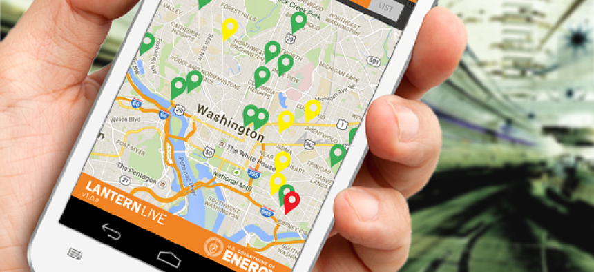
The Energy Department’s Lantern Live app, which helps people find gas stations during power outages, also weaves together form and function well, Parcell said. In particular, the app has a crowdsourcing feature that allows people to report which gas stations still have fuel available during an emergency.
Parcell also cited the IRS’ IRS2Go app, which lets users check on the status of their tax refunds. And the agency continues to update the app — for example, by making a number of changes for the current tax cycle and simplifying screens after users reported that “they were having to do too much,” he said.
In addition, agencies should make sure they’ve incorporated approaches already used elsewhere to design similar tools.
“Whatever field you’re developing your app for, you need to understand the science and research of that field and make sure you’re building on top of that foundation of understanding that’s been accumulated over time,” said Joseph South, deputy director of the Education Department’s Office of Educational Technology.
He added that it’s often a good idea to create what is called a minimum viable product — “a small product that minimally meets the requirements — and then get it in the hands of users so they can give you feedback that helps you iterate your design in ways that will be most useful to them.”
Training-free app design
Developing a new app for your agency? Make sure potential users don’t need to invest much time figuring out how to use it, app designers say. If training is required, your audience might already be lost.
“For mobile apps and even desktop apps, if it requires training then you...did not do a quality or complete job of user-experience design,” said Tim Young, a principal at Deloitte Digital, which helps government agencies design apps.
To avoid confusion, the design must account for the user experience well enough to anticipate any navigation hurdles. To do that, Deloitte’s app design process builds toward a highly refined profile of the end user, which starts with identifying the appropriate platform, whether it’s iOS, Android, Windows or multiple platforms.
The firm’s user-experience designers conduct ethnographic research, focus groups and stakeholder interviews and dive deep into the user preferences they uncover. People in a rural area might have spotty Internet access, for instance, so an app designed for them might incorporate an auto-save function.
Young said aligning an app’s requirements and the target user group’s characteristics requires discipline. “It’s not, ‘Here are some requirements I came up with because I’m a coder and I’m good,’” he said. “That’s not how this works. That’s not how you get high technology adoption rates with very low training costs.”
“The bottom line is user-centricity, making every decision on design based on what the users want and need versus what the client or the developer wants,” Young added.


