Visual analytics shines in solar research

SAS Visual Analytics helped researchers at NASA’s Goddard Space Flight Center sift through sun simulation data to identify points of interest and find relevant data relationships.
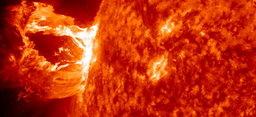
Researchers at the Goddard Space Flight Center work with massive amounts of simulated data in their efforts to understand how the magnetic arches rising from the sun’s surface affect Earth’s power grids and satellites.
But finding the exact time and place when these magnetic disturbances take place has been like looking for a needle in a haystack. While the researchers have access to massive datasets generated by simulations run on supercomputers, they can only make qualified guesses as to where in the data they might find evidence of the magnetic phenomenon by studying slices or samplings of the data. Even when evidence of magnetic disturbances is discovered, researchers cannot be sure they’ve found all the relevant data.
The problem was sifting through “the growing amount of data we have from numerical solutions of sun simulations,” said Lars Daldorff, a contracted researcher at Goddard. The agency was looking for an existing commercial solution that would search, categorize and filter all the solar research data from the simulations – not just the samples.
To improve on its “guess, fail, repeat” cycle, Goddard turned to SAS Visual Analytics for help detecting and identifying when and where the magnetic events occur. Researchers restructured the sun simulation datasets and loaded them into a big data in-memory environment on a Microsoft Azure cloud running SAS Visual Analytics, according to Daldorff.
Daldorff’s team used statistical analytical methods widely used in the business world on its sun simulations data, combining computational power and statistics to identify points of interest, find relevant data relationships, perform analysis and create visualizations and reports. The scientists were then able to use web-based SAS Visual Analytics, which helped them summarize and join data and enhance the predictive power of the collected data.
By displaying massive stores of information visually, researchers were able to extract more relevant data from more sources in less time. Visual analytics helped researchers not only find the data that they were specifically targeting but also locate any other relevant information that might have otherwise been overlooked.
Raw data from the simulations can now be converted into actionable data in a day rather than a week, reducing cost, man hours and the need for additional resources. The time between when the data was collected and what insights can be drawn from it is greatly decreased; perhaps one of the most crucial improvements for Daldorff and his team.
Overall, the findings from this data will help NASA determine the effects of the increase in X-ray and ultraviolet radiation crossing the solar atmosphere and penetrating the upper atmosphere of Earth. “It provides us with more of an understanding of what’s going on,” Daldorff said.
Daldorff’s team hopes to continue its work with SAS Visual Analytics for this study, future projects and daily use. “We need to experiment a little more with it and see how we can use it and its capabilities for our purposes.” But, he said, “so far, so good.”
NEXT STORY: EPA eyes digital services marketplace


