Map-based tools smooth early voting


Connecting state and local government leaders
Geographic information systems are helping improve the voting experience for both voters and election officials.
Election 2016 is a game changer, but maybe not in the way we might think. Yes, we have the first female candidate for president; and sure, the candidates themselves are capturing international headlines daily, but this election is a landmark in another way: the use of technology to improve the voting experience for both voters and the election officials charged with ensuring a smooth voting process.
It’s no secret that we struggle with voter turnout in this country. In fact, the number of Americans voting each election has been declining for the past 50 years. The reasons behind low voter turnout are many: lack of excitement for candidates involved, difficulties with voter registration and frustration at the time it takes to cast a vote. A 2014 Brennan Center report suggests that an insufficient number of poll workers and not enough voting machines are key contributors to long lines and longer wait times.
The data’s in the details
The Pew Charitable Trusts has studied the election process and produces an Election Performance Index. The EPI allows state officials to compare data from the last two mid-year elections and the last two presidential elections to identify areas in which states can improve to make them more cost-effective and efficient. The EPI provides data on:
- Voter turnout
- Wait times at polling locations
- Availability of voting information tools online
- Rejection of voter registrations
- Problems with registrations or absentee ballots
- Rejection of military and overseas ballots
- Accuracy of voting technology
Based upon this data, Pew makes recommendations to increase performance numbers in any of these areas. When it comes to voter experience, it recommends using polling place management tools to allocate resources and reduce waits.
Election officials take these suggestions, as well as similar recommendations by the Presidential Commission on Election Administration, very seriously. After all, no county wants to be highlighted as a cautionary tale in post-election analysis. The EPI found that in 2014, precincts reported an average 3.8-minute wait time, with North Carolina reporting the longest wait times: 8.8 minutes. Getting wait times down and helping provide a better voter experience are goals for every precinct across the country. One way to help manage polling places and reduce waits is with geographic information systems-enabled tools.
When poll workers can collect current wait times at polling stations through a GIS-enabled mobile device and upload that information instantly onto a map, they’re providing their electorate with data on wait times. That is exactly what is happening in Cobb County, Ga., where the county’s poll workers upload wait times for early voting, and the information is layered onto an online public-facing map so voters can avoid lines.
In the past, providing this data had been a very manual process. A poll worker would send an email on the approximate wait times to a web administrator who would then post that time on an online map. The lag time between this information being sent, gathered and then updated led to inaccurate wait times that frustrated the electorate.
Cobb County took it a step further and created a story map into which officials included not only the polling location map but also layers/tabs with more easily digestible polling information for the electorate in one location. (This was one of the suggestions from the Pew Charitable Trust.) The story map launched the Monday early voting started and the response was impressive: over 13,000 views in just one week for a county where early voting is held in just two locations.
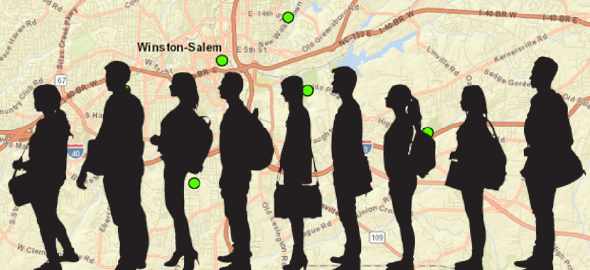
Forsyth County, N.C., also is using GIS to help provide real-time wait-time information for early voting locations. Poll workers use iPads with a simple web interface that consists of, literally, a start and stop button. When a voter enters the polling queue, a poll worker gives him or her a plastic card on a lanyard and pushes the start button on the iPad screen. When the voter gets to the point of actually voting, he turns in the lanyard, and the polling worker presses the stop button they see on their iPad screen. The time between the pushing of the start and stop buttons is automatically uploaded to a database that syncs with a publicly available online map. The wait times displayed on the web map are updated every 30 seconds, providing voters with real-time wait time information. In less than a week since launch, there have been more than 16,000 views. While this is only intended for use during early voting, the county says it will consider rolling it out for future election days as well.
As an added bonus, these elapsed time records are not deleted – each one is saved so that the data to be reviewed after the election to help determine peak voting times, allowing for more informed planning for future elections.
The focus on providing a better experience for the voter through technology is really exciting this election. I am looking forward to seeing the impact of these innovations on future elections.


