New tool offers unprecedented access to U.S. election data

An interactive version of the 2016 Election Administration and Voting Survey lets users examine a wide range of election-related data at the state and local level, as well as compare jurisdictions side by side.
Every two years after a November mid-term or presidential election, the Election Assistance Commission surveys states about their election practices, compiles that data and submits a report to Congress. The 226-page 2016 Election Administration and Voting Survey includes data on voter registration, turnout, absentee and pre-election voting, precinct and polling places and military and overseas voting.
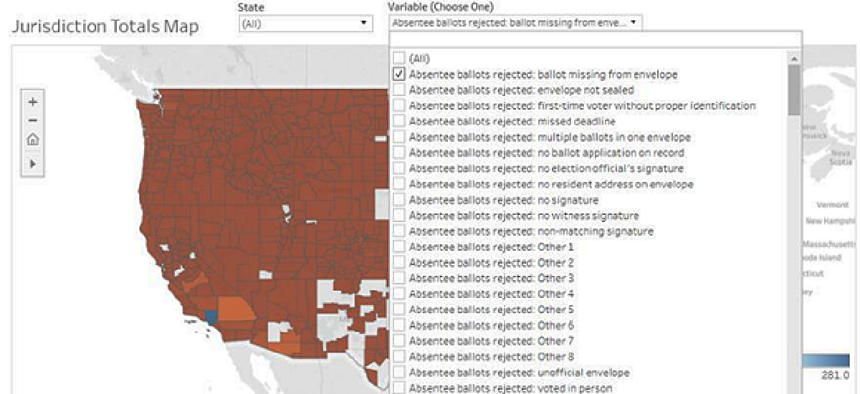
While the report contains charts and downloadable datasets, the EAC recognized that election officials at the county and municipal level might need help manipulating the data for their own analysis. On Dec. 13, EAC released the EAVS Data Interactive, a new data visualization tool that lets election officials, academics, activists and others examine specific data at the state and local level, as well as compare jurisdictions side by side.
“One of the messages that we’ve heard from state and local election officials is they desire to able to interact with this data, visualize it and use it to look at themselves and compare themselves with similar jurisdictions across the country,” EAC Chairman Matthew Masterson told GCN. “This dashboard is a response to allow them to use the data to evaluate their processes and procedures as they look to improve their operations.”
The Tableau-based visualization platform allows users to examine data through interactive maps, charts and graphs that drill down into details on voter registration, absentee and provisional ballots and voter turnout by voting method. By selecting a baseline county or municipality, users can compare multiple variables and filter responses based on the number of registered voters.
Although election officials can network with and learn from their peers at events, the interactive EAVS visualization gives stakeholders a way to see how they compare to similarly sized jurisdictions.
When he worked for the Ohio Secretary of State, Masterson used the EAVS data to study the reasons for provisional ballot rejections. He was able to create “simple updates” to a form that resulted in “tangible improvements” in acceptance rates, he said. This visualization tool should make analysis like that simpler.
The EAC plans to provide training for election officials on how to use the interactive tool.
When the EAC started to collect data for its survey in 2004, states were not always able to provide all of the information the commission asked for. But as states' data collection methods got more sophisticated, it was easier for EAC to spot errors and omissions in the submitted data. With the 2016 survey, EAC was able to go back to the states for the first time to ask questions regarding blank responses and unusual entries. More consistent data enabled the agency to compile more comprehensive datasets and populate the visualization platform.
“They are able to make changes to the data, and we publish it as it is released to us,” EAC Director of Research Sean Greene said. “We are always looking for ways to make the process easier for them to complete and easier for us to ensure that we are getting the most accurate data possible.”


