Data-driven communications lessons from COVID-19

Agencies that embraced data analytics and visualizations during the past year gained powerful communications capabilities that helped them increase transparency, share vital information and improve responsiveness.
When the pandemic first struck the U.S., state and local governments looked for ways to swiftly and accurately communicate information like case numbers, death tolls, infection rates, testing site locations, contact tracing and economic impact. States used data analytics and dashboards to provide governments, businesses, humanitarian groups and other organizations with the in-depth visualizations of COVID-19 data they needed to make effective decisions.
With information changing rapidly throughout the early stages of the pandemic, the public sought access to reliable, trusted sources of information, including state and local governments. States that embraced data visualizations and transparency were able to provide their citizens with facts and statistics more quickly to make more informed decisions for their health and safety and follow recommended protocols.
Now, with the vaccination effort underway, the end of the coronavirus pandemic is in sight. The advancement and embrace of data analytics and visualizations during the past year has given many government agencies powerful communications capabilities that can help them increase transparency, share vital information, and improve responsiveness.
Public sector leaders are finding new ways to leverage visualization capabilities to share data relating to the workforce, transportation, human services and more. Governments can provide information to citizens to inform them and help them make better decisions based on accurate data. State and local leaders are shifting from using analytics and dashboards solely for COVID-19 data to leveraging dashboards to share information across a wide range of applications.
Through collaboration with our public sector customers, we have learned some valuable lessons for agencies seeking to expand their use of data visualizations:
Make knowledge accessible. Websites hosting federal, state and local information regarding the pandemic are everywhere. Putting the data on an online landing page is a good start, but agencies must drive traffic to a site to ensure people view the information. If the data is out there, but it’s not being utilized, it does not add value. Publicize what facts are available and inform constituents about where they can find dashboards.
Prioritize the user experience. Attention spans are short, and people are bombarded by information. It is essential agencies make their communications stand out. Sites and dashboards should be clear, concise and interactive to eliminate confusion. When building a dashboard, agencies should find the balance between providing too little or too much information. Landing on the right combination of visual appeal and depth takes iteration. Data analytics is a science, but making a dashboard informative yet simple is a bit of an art.
Keep the data fresh. If agencies are not maintaining timely data, viewers will look elsewhere. Monthly updates -- a very familiar cadence for many government agencies -- seem “stale” compared to news outlets and less reliable sources on social media. Plus, when the data is old, it can undermine trust with citizens who will look elsewhere -- and potentially fall victim to misinformation from another source.
Many states use dashboards to communicate facts, data and statistics to their constituents through public-facing websites. Below are two examples of ways states successfully implemented dashboards for COVID-19 communications and applied those skills to offer additional visualizations across multiple datasets.
Missouri has been leveraging analytics for the past few years but stood out nationally when it answered its COVID-19 response with supreme transparency via data and analytical dashboards for Show-Me State citizens. Its Show-Me Strong portal features critical dashboards on the three areas that matter most to Missourians: public health, economic recovery and social impact. The first two deliver highly relevant information on cases, deaths, tests and the most important current area of focus, vaccine management. The value to the citizens is immeasurable, and the value to the state is significant, as it continues to explore ways to leverage data for good.
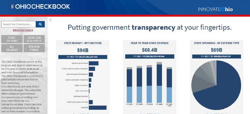
Ohio, meanwhile, has been deploying dashboards around a digital citizen experience for many years, originating with the launch of its Ohio Checkbook. The Checkbook is a first-of-its-kind site that enhances government transparency by providing real-time state budgeting, financial and transactional data all in a single solution. Leveraging that expertise, Ohio became one of the first states to deploy public dashboards around the COVID pandemic at coronavirus.ohio.gov, and it continues to publish more dashboards on the site that drill down on topics like schools, long-term care facilities and vaccines.
Delivering clear information from the scientific community in easily understood visualizations helps citizens feel better informed, builds trust and increases compliance with response measures, not only to the pandemic but across all government efforts. A more responsive, trusted government depends on state and local officials sharing timely and accurate information through visualizations and dashboards.


