COVID dashboard tracks county virus spread

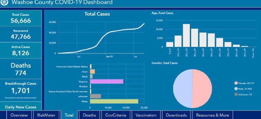
Washoe County, Nev., turned to Esri ArcGIS to create a dashboard that would monitor the virus’ progression through the area.
Washoe County, Nev., which includes the popular destination Reno, is struggling with a resurgence of COVID cases – about 250 new ones per day, on average, said Scott Oxarart, communications manager at the county’s Community Health District. He, along with other county workers and residents, knows this because of a dashboard Washoe uses to monitor the virus’ progression through the area.
At the start of the pandemic last year, however, tracking wasn’t as easy. “I was literally having to pick and choose data out of a spreadsheet that was being provided to me,” Oxarart said.
After a few weeks, he consulted with IT staff, which recommended using Esri ArcGIS to create a dashboard that would put all the data in one place.
“It just became a seamless process where the same information that our disease investigators are already collecting would just get screened to make sure there’s no sensitive data that was being exposed,” he said. The data was “then just straight up uploaded into this platform, and it would spit out the numbers just perfectly.”
It’s not a fully automated process, though. The department’s statistician screens the data for sensitive information before uploading the Microsoft Excel spreadsheet using an already established process required for reporting data on cases and deaths to the state and Centers for Disease Control and Prevention.
Despite the tourism draw of Reno’s casinos, the county reports data only about its residents. As the pandemic has played out, though, it has made a practice of alerting health agencies in other counties when a tourist tests positive. County epidemiologists and disease investigators who study the data can sometimes determine that someone with COVID-19 was visiting from somewhere else, and they contact their hometowns to report the finding.
Recently, the county added more information, including vaccine stats, positivity rates and forward-looking data that shows whether the transmission rate is high, substantial or low. That can determine whether county leaders implement spread-mitigation strategies such as social distancing, capacity restrictions at bars and restaurants or mask mandates.
The agency also incorporated other data, such as test positivity, medical interventions and hospital capacity. The dashboard’s Risk Meter tab gives an at-a-glance weekly rating of transmission -- right now it’s “very high” and approaching critical -- and lists ways people can stay safe.
Other tabs provide links to find a place to get vaccinated, breakdowns on total cases and deaths by age, gender and ethnicity. A Spanish version of the dashboard is also available from the tabs.
“It’s completely transformed how we look at data [and] how we present information to the public,” Oxarart said of the dashboard.
It’s also changing how the county uses data to take action. For instance, when the agency noticed that the county’s large Hispanic population had a low vaccination rate and high positivity rate, it kicked off a campaign called “Mask On, Move On” with promotional materials in English and Spanish. They also set up a community vaccine event at a church in a heavily hit ZIP code one Sunday and dispensed 600 doses, Oxarart said.
Along those lines, Esri makes publicly available nationwide maps that users can drill into to see where vaccination hot spots are and where they aren’t so that local officials can determine how to best serve those areas. Additionally, the maps show how far residents must drive or walk to reach a vaccination site.
“People are using those to make a lot of decisions right now,” Esri Chief Medical Officer Este Geraghty said. “The two main things I’m seeing are how to iteratively choose new vaccination venues and make sure that certain populations are being served.”
Now, Oxarart said the county is working on how to add vaccine booster information ahead of the Sept. 20, when they will become available to the general population.
“We have to show which doses are first doses as opposed to those boosters,” he said. “We can’t just throw it all together and say we have almost 500,000 doses administered.”
Beyond COVID, he’d like to create a similar dashboard for other contagious illnesses. Currently, the agency’s flu surveillance report is a four-page PDF. “I think we absolutely need a dashboard like this because not only are people more educated about communicable disease, I think they’re going to follow flu stats more,” Oxarart said. “We have all that data so we’re definitely looking at ways we can show that data.”
Other counties using geographic information systems to navigate COVID and vaccine challenges include Milwaukee County, Wisc., whose dashboard focuses on vulnerability and racial equity; Suffolk County, N.Y., whose dashboard helps officials identify people who are vaccine-hesitant or non-English speakers; and Will County, Ill., which recently held a vaccination clinic for young adults with special needs.


