Missouri maps COVID in wastewater

University of Missouri - Columbia
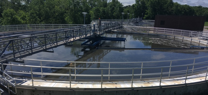
The Sewershed Surveillance Program gets samples from more than 100 locations – covering more than half the state's population – to create maps that help decision-makers monitor trends in the spread of the virus.
Missouri is mapping COVID-19 hot spots and trends based on data from wastewater.
With a glance, map viewers can see not only where cases are high, but if the predominant variant is omicron or delta and whether the infection rate is rising or falling.
The state launched the Sewershed Surveillance Program in April 2020 and now has more than 100 community Department of Natural Resources locations that voluntarily send samples for testing once a week and a few smaller locations that submit samples twice a week. This covers more than half of the state’s population of about 6 million.
“We found that … a 40% increase in viral load was a predictor that there would be at least a 25% increase in known human positive cases that next week,” said Jeff Wenzel, bureau chief of the Bureau of Environmental Epidemiology of the Missouri Department of Health and Senior Services, adding that the results have a 70% accuracy rate.
To predict decreasing trends, the state needs more samples because people can shed a viral signal in their waste for up to 30 days after they’re no longer contagious.
The wastewater operators send the samples they collect by courier to a lab at the University of Missouri in Columbia, where researchers perform sequencing, which produces about a terabyte of information per sample. The state gets results from those tests two weeks after a sample is collected.
Since February 2021, the state also has taken advantage of a process that the university developed to look at one variant at a time. Those results take about a week to 10 days.
“We were the first, and we remain one of the few states that are displaying this information to the public,” Wenzel said.
As soon as his team gets the raw data, however, they share it with public health agencies, wastewater operators and decision-makers, who can use it to inform decisions and policy.
Every Wednesday, Jeff Patridge, GIS specialist for the state, creates visualizations of the variants using Esri ArcGIS Pro, and every Friday he updates the trends. Wenzel’s team sends the GIS team a spreadsheet of the test results and they enter it into Esri-powered maps that use shapes and color coding to indicate the prevalence of COVID-19 – or lack thereof – in areas statewide.
For instance, one map shows pie charts of the variants: omicron (dark blue) and delta (light blue).

Missouri Department of Health and Senior Services
The Watershed Trends map below has red upward-pointing triangles for increasing viral loads, green inverted triangles for decreasing loads and yellow circles to indicate no change. Gray boxes mean no valid sample was available. That happened one week when a winter storm passed through the state causing widespread freezing.

Missouri Department of Health and Senior Services
It's a consistent picture, meaning that other than weather preventing us from getting samples, there’s not very many other interferences,” Wenzel said.
The state still uses other methods of tracking, including hospitalization rates and self-reporting. “The best method is to use as many methods as you can,” Wenzel added.
The graphics are included in a story map, which the state put together in January 2021 and includes descriptions and photos of the testing process.
“It’s really a good way to interact with the public, where we can give information, we can show photos, we can show the different dashboards and maps that we’ve put in there,” Patridge said.
The state started the wastewater testing project with funding from the Centers for Disease Control and Prevention’s Environmental Public Health Tracking Program, which led to more funding from CDC and the National Institutes of Health.
On Feb. 4, CDC launched the National Wastewater Surveillance System to track COVID trends. Wenzel said he’s still exploring how the state can use that data, but he added that his agency uses a different calculation, so comparing results will help improve accuracy.
“Having insight at every level of geography is important,” Este Geraghty, chief medical officer of Esri, wrote in an email to GCN. “Early in the pandemic we learned, through the Johns Hopkins University dashboard, how important a global and national perspective can be when we consider broad control and response policies (travel bans or restrictions, nationally sponsored testing and vaccination, and various mandates). At the same time, the local view is critical," she said. "Local governments are the ‘feet on the ground’ and need a much more refined neighborhood level perspective to apply limited resources to where they are needed most, propose and enforce local policies on mask wearing and social distancing, and communicate levels of risk within that critical context of place.”
Currently, only a few states have statewide data on CDC’s map. Geraghty said that’s likely because the program for testing COVID viral shedding is not mandatory and requires collaboration between governments and water municipalities. “The CDC is actively working with various local governments to develop the standard data formats for this kind of reporting,” she added.
Testing wastewater for pathogens is not new. It has been used to monitor for outbreaks of polio and Hepatitis A for more than 50 years, Geraghty said, and it can used to spot of opioid use.
“GIS enhances the value from wastewater testing programs,” she said. “With mapped information, it’s simple to determine where large populations reside, which communities are at higher risk for severe illness from COVID-19 or are more exposed to the disease, and places where clinical testing for COVID-19 may be unavailable or underused.”
Stephanie Kanowitz is a freelance writer based in northern Virginia.


