Ranking the Best and Worst City Flags

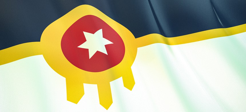
In a recent survey, the flag of Tulsa, Oklahoma, was ranked No. 1 by the North American Vexillological Association. Maksym Kapliuk via Getty Images

Connecting state and local government leaders
For the first time in nearly 20 years, a group of flag enthusiasts has released survey results grading the municipal banners, many of which have undergone recent redesigns.
Most cities have ugly flags. At least that’s the consensus of a recent flag design survey.
Of 312 city flags reviewed, more than 60% received a D or F, and just 30% an A or B. The average grade in the North American Vexillological Association’s 2022 city flag survey: a D+.
Vexillology is the study of flags, and NAVA, which itself does not judge flags, is an organization of over 1,000 flag enthusiasts and experts. The survey was conducted virtually from Sept. 1 to Nov. 30, and the results were released last month. More than 2,800 people participated.
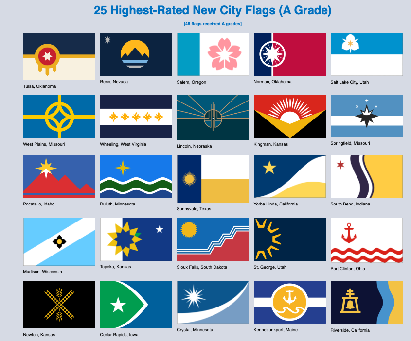
Tulsa, Oklahoma, received the highest marks for its flag, which features a bold graphic pattern that aspires to capture a complex sweep of the city’s natural and cultural heritage, both good and bad—ranging from the Arkansas River, to an infamous 1921 race massacre.

The “honor” for the worst-rated flag went to Ranger, Texas. That municipal pennant—adorned with a Texas Ranger badge, a historic oil rig and the local school district’s bulldog mascot—was the work of a local sixth grader and selected by a panel of civic leaders in 2019 from about 100 other designs submitted by public school students, according to the Abilene Reporter News.

This is the second survey of city flags by the association. The first was nearly 20 years ago in 2004. The decision to conduct a new survey came as flags, it seems, are having a moment.
Cities Have Had It With Their Ugly Flags
“The big picture here is that there was a wave of city flag redesign across the nation,” said Ted Kaye, secretary of NAVA and author of the book on flag design, Good Flag, Bad Flag. “Whereas 20 years ago, we saw one or two redesigns, today hundreds are doing it or have processes underway.”
Indeed, each of the 312 flags rated in the most recent survey are either new or have been redesigned since NAVA’s last survey. Tulsa, for example, redesigned its flag in 2018. Its old flag ranked 124th in the previous survey.
Being called the worst, it seems, can motivate a city to revisit its flag. In 2004, the flag of Pocatello, Idaho, was ranked the worst. In 2022, it ranks 11. “From zero to hero,” Kaye said.

It is a similar story for Salem, Oregon, which adopted a new flag last year. The redesign yielded a soft blue block celebrating the Willamette River, a star signifying the city’s state capital status and a cherry blossom. The city originally ranked 51st with a design dating to 1972 that said “Salem” on it and included a rendering of a pioneer statue. The updated flag ranked 3rd best.
In the cases of both Pocatello and Salem, the old flags made some common faux pas.
Kaye, who has consulted on hundreds of city and state flag overhauls, credits the rise in redesigns, in part, to Roman Mars’ 2015 Ted Talk on “why city flags may be the worst-designed thing you've never noticed.” Host of the podcast 99% Invisible, his talk has garnered nearly 7 million views.
Five Principles for a Beautiful Flag
In it, Mars reviews the five basic principles of flag design according to Kaye’s book: simplicity, meaningful symbolism, few colors, no lettering or seals, and distinctiveness.
The old flags in Tulsa, Salem and Pocatello all ran afoul of these principles in one way or another. Tulsa’s old flag was just the city’s seal on a white background. Vexillologists call this an S.O.B. flag—a seal on a bedsheet. The problem with this approach, according to Kaye, is that municipal seals were designed to be on stationary paper, not flying in the breeze 100 feet away where no one can make out the tiny lettering.
In Salem and Pocatello’s case, they both had their city’s names on the flag. Designers and vexillologists argue that if you have to put the name of your city on the flag, well, then the symbolism has failed.

Who Cares About Flags, Anyway?
So why should city officials care? After all, it’s just a flag. NAVA offers a simple response on its website: A well-designed city flag can foster civic pride and community cohesion, and it can support the city's branding and promotion.
“A great city flag,” Kaye added, “represents that place to the outside world and to city residents.”
Kaye offers New Mexico and Chicago as good examples of great flags. The latter’s love affair with its flag (four bold red stars, blue and white horizontal stripes) is well documented. According to a 2013 article in Chicago Magazine, “There’s a website devoted to pictures of Chicago Flag Tattoos. The flag is on T-shirts, hats, messenger bags, guitars, golf balls, coffee mugs, pillows, shower curtains and bars of soap.”
And as Roman Mars pointed out in his Ted Talk, it is the Chicago flag, not the American flag, that is draped over the coffins of the city’s fallen police officers and firefighters.
Don’t Redesign On a Whim
Be forewarned, however, that the process to adopt a new flag can be long and fraught with detours. “I always tell officials that 10% of the process is design and 90% is politics and public relations,” Kaye said.
A 2006 redesign of Salt Lake City’s flag fell flat. But Mayor Erin Mendenhall launched another effort in May of 2020, during the height of the pandemic, calling on the city to submit ideas.
“A well-done flag can capture the heart and soul of a community and foster a real sense of pride. I’m excited for Salt Lake City to have a flag that better represents this beautiful, unique place and our people,” Mendenhall said in a statement at the time. “With everything happening in the world, a creative, community pursuit like this is a welcome change.”
Kaye praised the effort as a model for other communities. The city received more than 600 entries, which were reviewed by a design committee made up of Kaye, the director of the Salt Lake City Arts Commission, former Gov. Mike Leavitt and others. The committee selected finalists, which were rated by the public before the mayor and city council made a final choice.

The flag was adopted just a few months later in October 2020, and in this year’s survey was the fifth-highest rated flag, up from 99 in NAVA’s 2004 survey.
States Have Had It With Their Flags, Too.
While it is mostly cities that are redesigning their flags, some states have also been getting in on the action.
This legislative session, Utah lawmakers are expected to vote on whether to adopt a new flag design. The old one is an S.O.B., featuring the state seal on a blue background. A state flag task force was created last year and received 7,000 flag designs and 44,000 public comments. The finalist features a mountain landscape, beehive and an eight-pointed star to represent Utah’s Tribal Nations.

In addition to Utah, Massachusetts is exploring alternative flag options, and there is a bill in Minnesota that would create a commission to redesign its flag. In both states, at issue is the depiction of American Indians in the current flags.
Similarly problematic imagery has been the impetus for all recent state redesigns—with the exception of Utah—according to Kaye. “In each case,” he said, “the tipping point was offensive symbolism.”
Georgia and Mississippi have both adopted new flags in the last 20 years and, in those instances, the states’ removed Confederate battle flags.
Whatever the reason, Kaye sees this as a good development. “It is heartening to see this interest in flags,” he said. “When a place doesn’t have strong symbols, they cede that territory to sports teams [and tourism agencies].”

NEXT STORY: Minnesota to Require 100% Carbon-free Electricity by 2040


